
When people buy something on our website or subscribe to the newsletter, we generally redirect them to a “Thank You” page. It’s a great opportunity to engage with our audience more closely & build business relationships.
In this post, I will give you a thank you page template. And I will show you how I created this only using HTML & CSS.
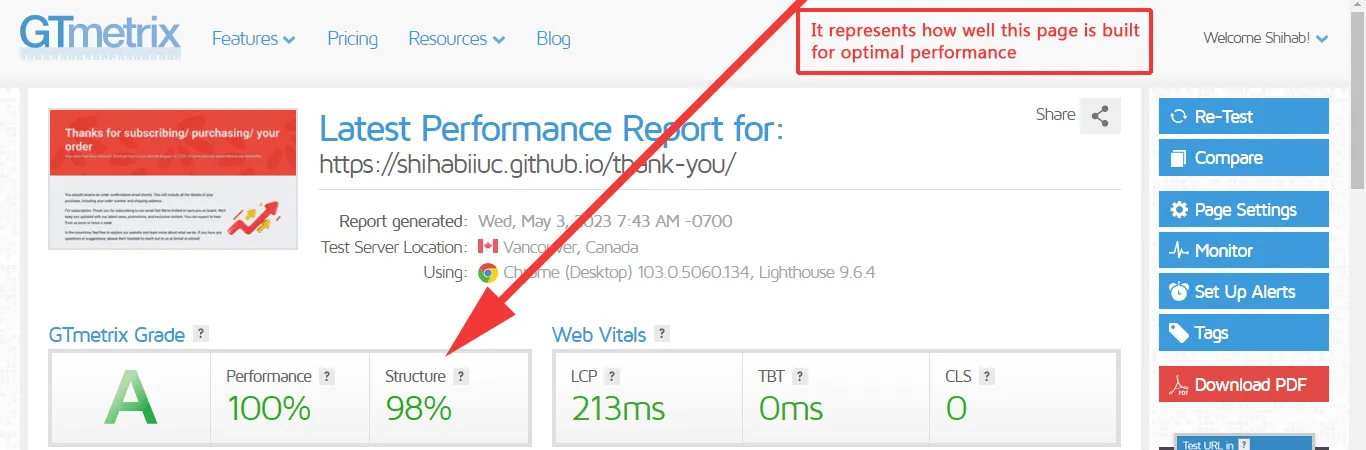
This template is fully mobile responsive, fast loading & well-structured. When I say well-structured, it means that I used semantic HTML where/when necessary and I did not even include a wrapper <div> just for the sake of limiting the max-width value. See the GTmetrix report in the screenshot below:
Also, it’s an opportunity for you to practice & learn HTML CSS and aligning elements.
Anyways, before you start, let’s see the live demo of this page.
Source code for this thank you page template
Before I give you the HTML & CSS, it’s important to understand the project structure. Otherwise, the file paths may mismatch.
See my files & folder structure in the infographic below.
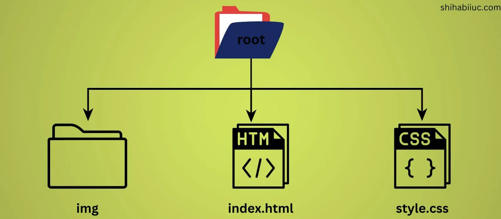
You can name the root or main project folder whatever you like (I named it ‘thank-you’). In the root, you have to create one folder called “img” that will contain all the images/assets. Also, you need to create two other files named “index.html & style.css.”
However, index.html generally refers to the home page (front page). So you can rename this to “thank-you.html” if you already have a file named “index.html.” Either way, let’s get started.
HTML
<section class="banner"> <!-- confirmation message --> <h1>Thanks for subscribing/ purchasing/ your order</h1> <!-- Gratitude message --> <p>Your order has been received. You'll get this to your ...</p></section><!-- .banner --><!-- Next steps --><section class="next-step"> <div class="container"> <div class="three-fourth"> <p>You should receive an order confirmation email shortly. ...</p> <p>For subscription: Thank you for subscribing to our email...</p> <p>In the meantime, feel free to explore our website and learn....</p> </div> <div class="one-fourth"> <img src="./img/growth.png" alt="growth infographic"> </div> </div></section><!-- .next-step --><!-- Offer an incentive --><section class="offer"> <div class="container"> <div class="one-fifth"> <img src="./img/wait.jpg" alt=""> </div> <div class="three-fifth"> <h2>Wait! We have a bonus for you!</h2> <p>As a token of our appreciation, we'd like to offer you a 10% discount...</p> <p>For subscription: We've created an exclusive ebook ...</p> <p>To download your free ebook, simply click on the button below.</p> <a href="./img/search-technic.pdf" target="_blank" download>Download ebook</a> </div> <div class="one-fifth"> <img src="./img/gift.jpg" alt=""> </div> </div></section><!-- .offer --><!-- Related content --><section class="related-content"> <h2>Visit our blog</h2> <p>Throughout the years, we have been doing our own research...</p> <div class="post-container"> <div class="post"> <h3>Consectetur adipisicing elit</h3> <img src="./img/coconuts.jpg" loading="lazy" alt="coconuts"> <p>Lorem ipsum dolor sit amet consectetur adipisicing elit...</p> <a href="#">Read more ⤍</a> </div><!-- .post --> <div class="post"> <h3>Autem aut eos accusantium</h3> <img src="./img/vegetables.jpg" loading="lazy" alt="vegetables"> <p>Auas beatae blanditiis adipisci exercitationem reprehenderit...</p> <a href="#">Read more ⤍</a> </div><!-- .post --> <div class="post"> <h3>Repudiandae ducimus inventore</h3> <img src="./img/garden.jpg" loading="lazy" alt="garden, flowers"> <p>Nonmaiores animi cum placeat. Lorem ipsum dolor sit amet quas recusandae...</p> <a href="#">Read more ⤍</a> </div><!-- .post --> </div><!-- .post-container --></section><!-- .related-content -->If you want, you can download all the pictures from this link.
CSS
*, *::before, *::after { -webkit-box-sizing: border-box; box-sizing: border-box;}body { font-family: 'Roboto', sans-serif; background-color: #EBECF0; padding: 0; margin: 0;}img { max-width: 100%;}h1, h2, h3 { margin: 0;}h2 { font-size: 1.7em; font-weight: 700;}@media (min-width: 768px) { h2 { font-size: 3em; }}h3 { font-size: 1.5em; font-weight: 700;}@media (min-width: 768px) { h3 { font-size: 1.7em; }}p { font-size: 1.25em; margin: 0 0 20px; line-height: 1.7; font-weight: 400;}section:not(.banner) { padding: 90px 15px; background-color: #FFFFFF;}section:nth-child(even) { background-color: transparent;}.container { max-width: 1200px; margin: 0 auto;}.banner { display: -ms-grid; display: grid; -ms-grid-columns: minmax(auto, 1200px); grid-template-columns: minmax(auto, 1200px); -webkit-box-pack: center; -ms-flex-pack: center; justify-content: center; padding: 90px 15px; background-color: #E74133; background: -webkit-gradient(linear, left bottom, left top, from(rgba(231, 65, 51, 0.95))), url(./img/bg-banner.png) repeat; background: linear-gradient(0deg, rgba(231, 65, 51, 0.95)), url(./img/bg-banner.png) repeat;}.banner h1 { color: rgba(255, 255, 255, 0.85); font-size: 2em; font-weight: 700;}@media (min-width: 768px) { .banner h1 { font-size: 4em; }}.banner p { color: #FFFFFF; margin-bottom: 0; text-shadow: 1px 1px #222222;}.next-step .container { display: -webkit-box; display: -ms-flexbox; display: flex; -webkit-box-pack: justify; -ms-flex-pack: justify; justify-content: space-between; -webkit-box-align: center; -ms-flex-align: center; align-items: center; -ms-flex-wrap: wrap; flex-wrap: wrap;}.next-step .container .three-fourth { -webkit-box-ordinal-group: 3; -ms-flex-order: 2; order: 2; -ms-flex-preferred-size: 100%; flex-basis: 100%;}@media (min-width: 768px) { .next-step .container .three-fourth { -webkit-box-ordinal-group: 2; -ms-flex-order: 1; order: 1; -ms-flex-preferred-size: 75%; flex-basis: 75%; }}.next-step .container .one-fourth { -webkit-box-ordinal-group: 2; -ms-flex-order: 1; order: 1; -ms-flex-preferred-size: 100%; flex-basis: 100%; margin-bottom: 30px;}@media (min-width: 768px) { .next-step .container .one-fourth { -webkit-box-ordinal-group: 3; -ms-flex-order: 2; order: 2; -ms-flex-preferred-size: 25%; flex-basis: 25%; margin-bottom: 0; }}.offer .container { display: -webkit-box; display: -ms-flexbox; display: flex; -webkit-box-pack: center; -ms-flex-pack: center; justify-content: center; -ms-flex-wrap: wrap; flex-wrap: wrap;}@media (min-width: 768px) { .offer .container { -webkit-box-pack: justify; -ms-flex-pack: justify; justify-content: space-between; }}.offer .container .one-fifth { -ms-flex-preferred-size: 100%; flex-basis: 100%;}@media (min-width: 768px) { .offer .container .one-fifth { -ms-flex-preferred-size: 20%; flex-basis: 20%; }}.offer .container .one-fifth img { width: 100%; height: auto;}@media (min-width: 768px) { .offer .container .one-fifth img { height: 100%; width: auto; -o-object-fit: cover; object-fit: cover; }}.offer .container .three-fifth { -ms-flex-preferred-size: 100%; flex-basis: 100%; background-color: #EBECF0; padding: 20px 15px;}@media (min-width: 768px) { .offer .container .three-fifth { -ms-flex-preferred-size: 60%; flex-basis: 60%; }}.offer .container .three-fifth a { text-transform: uppercase; color: #E74133;}.related-content { display: -ms-grid; display: grid; -ms-grid-columns: minmax(auto, 1200px); grid-template-columns: minmax(auto, 1200px); -webkit-box-pack: center; -ms-flex-pack: center; justify-content: center;}.related-content .post-container { display: -webkit-box; display: -ms-flexbox; display: flex; -webkit-box-pack: justify; -ms-flex-pack: justify; justify-content: space-between; -ms-flex-wrap: wrap; flex-wrap: wrap;}.related-content .post-container .post { -ms-flex-preferred-size: 100%; flex-basis: 100%; margin-bottom: 60px; background-color: #d9e7ff; border: 1px solid #5895fc; border-radius: 4px;}@media (min-width: 768px) { .related-content .post-container .post { -ms-flex-preferred-size: 30%; flex-basis: 30%; margin-bottom: 0; }}.related-content .post-container .post h3 { min-height: 90px; display: -webkit-box; display: -ms-flexbox; display: flex; -webkit-box-align: center; -ms-flex-align: center; align-items: center; margin-left: 10px;}.related-content .post-container .post img { width: 100%;}.related-content .post-container .post p { margin: 20px 10px;}.related-content .post-container .post a { margin: 0 10px 30px; display: inline-block; text-decoration: none; color: #E74133; -webkit-transition: color 0.4s ease-in-out; transition: color 0.4s ease-in-out;}.related-content .post-container .post a:hover { color: #357ffc;}If you’re familiar with SASS, you can use my style.scss file instead. But it’s not mandatory.
Download the whole project from GitHub
I already have given you the HTML, CSS & assets. Therefor if you need to download the entire project, you can do it from my GitHub repository.
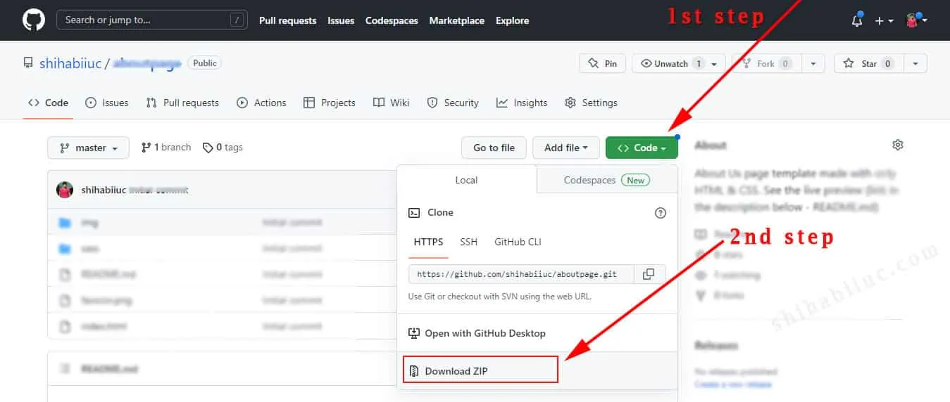
Or use the following command in your terminal: git clone https://github.com/shihabiiuc/thank-you.git
Build HTML CSS projects
<table><tbody><tr><td><a href=“/about-page-template/”>About us template</a></td><td><a href=“https://shihabiiuc.github.io/aboutpage/” target=“_blank” rel=“noreferrer noopener”>Preview</a></td></tr><tr><td><a href=“/team-page/”>Team page</a></td><td><a href=“https://shihabiiuc.github.io/team-members-section/” target=“_blank” rel=“noreferrer noopener”>Preview</a></td></tr><tr><td><a href=“/testimonial-template/”>Testimonial page</a></td><td><a href=“https://shihabiiuc.github.io/testimonialpage/” target=“_blank” rel=“noreferrer noopener”>Preview</a></td></tr><tr><td><a href=“/testimonial-slider/”>Testimonial slider</a></td><td><a href=“https://shihabiiuc.github.io/testimonialslider/” target=“_blank” rel=“noreferrer noopener”>Preview</a></td></tr><tr><td><a href=“/contact-page-html-css/”>Contact page</a></td><td><a href=“https://shihabiiuc.github.io/contact-page/contact-us.html” target=“_blank” rel=“noreferrer noopener”>Preview</a></td></tr><tr><td><a href=“/create-multiple-page-website-html/”>Multipage website</a></td><td><a href=“https://shihabiiuc.github.io/multipagehtml/” target=“_blank” rel=“noreferrer noopener”>Preview</a></td></tr><tr><td><a href=“/portfolio-website-design-with-html-css/”>Portfolio website</a></td><td><a href=“https://shihabiiuc.github.io/portfolio/index.html” target=“_blank” rel=“noreferrer noopener”>Preview</a></td></tr><tr><td><a href=“/animated-portfolio-website/”>Animated portfolio</a></td><td><a href=“https://shihabiiuc.github.io/animated-portfolio/” target=“_blank” rel=“noreferrer noopener”>Preview</a></td></tr><tr><td><a href=“/computer-science-portfolio-website/”>Computer science portfolio</a></td><td><a href=“https://shihabiiuc.github.io/computerscienceportfolio/” target=“_blank” rel=“noreferrer noopener”>Preview</a></td></tr><tr><td><a href=“/html-navigation-bar/”>Navigation bar (without JS)</a></td><td>N/A</td></tr><tr><td><a href=“/hamburger-menu/”>Create a hamburger menu</a></td><td><a href=“https://shihabiiuc.github.io/hamburger-menu/” target=“_blank” rel=“noreferrer noopener”>Preview</a></td></tr><tr><td><a href=“/html-footer/”>Footer templates</a></td><td><a href=“https://shihabiiuc.github.io/footer-examples/” target=“_blank” rel=“noreferrer noopener”>Preview</a></td></tr><tr><td><a href=“/hero-banner-image-using-html-css/”>Hero banner</a></td><td><a href=“https://shihabiiuc.github.io/herobanner/” target=“_blank” rel=“noreferrer noopener”>Preview</a></td></tr><tr><td><a href=“/background-slider/”>Background slider</a></td><td><a href=“https://shihabiiuc.github.io/backgroundslider/” target=“_blank” rel=“noreferrer noopener”>Preview</a></td></tr><tr><td><a href=“/how-to-create-3-column-layout-in-html-css/”>Three-column layout template</a></td><td><a href=“https://shihabiiuc.github.io/column-layout/” target=“_blank” rel=“noreferrer noopener”>Preview</a></td></tr><tr><td><a href=“/two-column-layout-html-css/”>Two column layout</a></td><td><a href=“https://shihabiiuc.github.io/two-column-layout/” target=“_blank” rel=“noreferrer noopener”>Preview</a></td></tr><tr><td><a href=“/thank-you-page-html-css/”>Thank you page</a></td><td><a href=“https://shihabiiuc.github.io/thank-you/” target=“_blank” rel=“noreferrer noopener”>Preview</a></td></tr><tr><td><a href=“/resume-html-css/” data-type=“link” data-id=“http://localhost/shihabiiuc/resume-html-css/">Resume template</a></td><td><a href=“https://shihabiiuc.github.io/resume/” data-type=“link” data-id=“https://shihabiiuc.github.io/resume/” target=“_blank” rel=“noreferrer noopener”>Preview</a></td></tr><tr><td><a href=“/coming-soon-template/” data-type=“link” data-id=“http://localhost/shihabiiuc/coming-soon-template/">Coming soon template</a></td><td><a href=“https://shihabiiuc.github.io/coming-soon/” data-type=“link” data-id=“https://shihabiiuc.github.io/coming-soon/” target=“_blank” rel=“noreferrer noopener”>Preview</a></td></tr><tr><td><a href=“/create-landing-page-using-html-css-js/” data-type=“link” data-id=“http://localhost/shihabiiuc/create-landing-page-using-html-css-js/">Landing page template</a></td><td><a href=“https://shihabiiuc.github.io/landing-page/” data-type=“link” data-id=“https://shihabiiuc.github.io/landing-page/” target=“_blank” rel=“noreferrer noopener”>Preview</a></td></tr><tr><td><a href=“/roofing-website-template-for-download-responsive/” data-type=“link” data-id=“http://localhost/shihabiiuc/roofing-website-template-for-download-responsive/">Roofing website template</a></td><td><a href=“https://shihabiiuc.github.io/roofing-website/” data-type=“link” data-id=“https://shihabiiuc.github.io/roofing-website/” target=“_blank” rel=“noreferrer noopener”>Preview</a></td></tr></tbody></table>
Conclusion
I created this template from scratch. It can be used as a “Thank You” page after buying a project/service or subscribing to a newsletter or something along those lines.
I also gave you the initial content for the page. You can edit them to match your requirements. Also, you can delete or add sections as you see fit.